Quite often I have a dataframe in R with lots of columns with one of the columns being the year. I then want to pick another column and make averages for each year and plot it to show how things have changed over time. I know this is really easy to do, but I end up Googling it every time, I thought that this time I’d write it up so I knew exactly where to look. I won’t go in to detail on what the commands do, or how to make the graph look funky.
Grab the data
In this example I have a dataframe of movies from IMDB and facts about. It looks something like this when I view it in R studio:
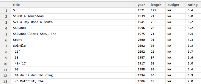
Movie dataset has title, year, length among other things
This dataset actually comes with ggplot2, if you’ve installed ggplot to you can get it using ‘movies’. Normally I want to use the year as the X axis, and then I want to find average of something for the Y axis, and group it by year, but I always forget how to. In this example I’ll plot the average length of movies for each year in the dataset.
Grab the ggplot and plyr libraries:
The first thing I need are ggplot and plyr packages. Assuming they are installed:
library(ggplot2)
library(plyr)
The I create a new dataframe that only has two columns, the year and mean. There may be a shortcut, but I just like to do things in steps:
mean_df<-ddply(movies, .(year), summarize, mean_value = mean(length))
You can then see the new dataframe has years and the mean length:
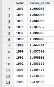
Year and mean
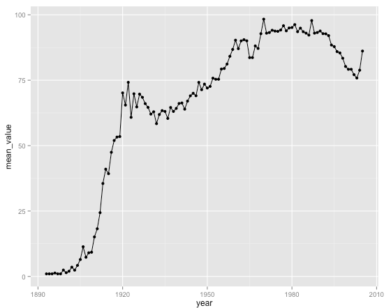
It is now very easy to plot them:
ggplot(data=mean_df, aes(x=year, y=mean_value)) + geom_line() + geom_point()
Which should leave you something like this:
 Final code:
[codesyntax lang=”text”]
install.packages("ggplot2")
library(ggplot2)
movies<-movies
library(plyr)
mean_df<-ddply(movies, .(year), summarize, mean_value = mean(length))
ggplot(data=mean_df, aes(x=year, y=mean_value)) + geom_line() + geom_point()
[/codesyntax]
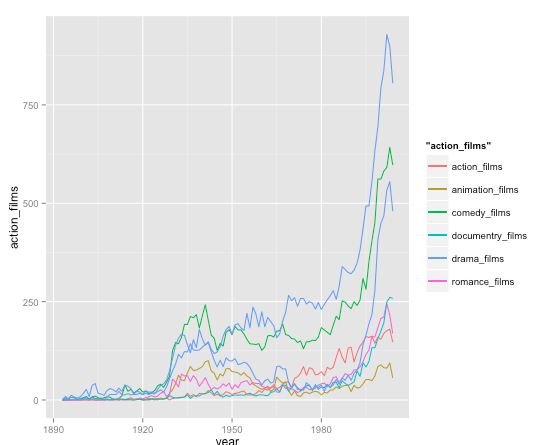
On another note sometimes I like to use values from multiple columns. In the movies dataset we have counts for the number of different genres of films. I think this is just how IMDB decide to label things, but it is still a useful example to write up for when I forget 2 months down the line. The code is:
mean_df<-ddply(movies, .(year), summarize, action_films = sum(Action), animation_films = sum(Animation), comedy_films = sum(Comedy), drama_films = sum(Drama), documentry_films = sum(Documentary) , romance_films = sum(Romance), short_films = sum(Short) )
ggplot(data=mean_df, aes(x=year, y=mean_value)) + geom_line() + geom_point()
ggplot(mean_df, aes(year)) +
geom_line(aes(y = action_films, colour = “action_films”)) +
geom_line(aes(y = animation_films, colour = “animation_films”)) +
geom_line(aes(y = comedy_films, colour = “comedy_films”)) +
geom_line(aes(y = drama_films, colour = “drama_films”)) +
geom_line(aes(y = romance_films, colour = “romance_films”)) +
geom_line(aes(y = documentry_films, colour = “documentry_films”)) +
geom_line(aes(y = short_films, colour = “drama_films”))
)
which gives you something like this:

0 Comments